Former Nintendo employees shed light on the intriguing differences between Kirby's American and original Japanese appearances. This article explores why Kirby's marketing shifted for Western audiences and delves into Nintendo's evolving global localization approach.
"Angry Kirby": A Western Makeover
Nintendo's Western Rebranding of Kirby
Kirby's transformation into a seemingly "fiercer" character on Western game covers and artwork—a phenomenon affectionately dubbed "Angry Kirby"—was a deliberate strategy. In a January 16, 2025, interview with Polygon, former Nintendo Localization Director Leslie Swan explained the reasoning behind this change. The goal wasn't to make Kirby angry, but to project determination. Swan noted the inherent cultural difference: "Cute, sweet characters are popular among people of all ages in Japan," she said, contrasting this with the perception that "In the U.S., though, tween and teen boys tend to be drawn to tougher characters."
Kirby: Triple Deluxe Director Shinya Kumazaki corroborated this in a 2014 GameSpot interview, stating that while cute Kirby resonated most strongly in Japan, a "strong, tough Kirby that’s really battling hard" better appealed to US audiences. He acknowledged the title-specific nature of this approach, citing Kirby Super Star Ultra's consistent, tougher Kirby depiction across both US and Japanese box art. Kumazaki emphasized the intention to showcase Kirby's serious combat side within the gameplay itself, while recognizing the enduring power of Kirby's cuteness in the Japanese market.
Marketing Kirby as "Super Tuff Pink Puff"
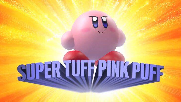
Nintendo's marketing actively aimed to broaden Kirby's appeal, particularly among boys. This led to the memorable "Super Tuff Pink Puff" branding for Kirby Super Star Ultra on the Nintendo DS in 2008. Former Nintendo of America Public Relations Manager Krysta Yang explained that this reflected a broader company effort to shed its "excessively kiddie" image. "There was certainly a period of time for Nintendo, and even gaming in general, to have a more adult/cool factor," she stated, adding that "Having a game that was labeled ‘kiddie’ was really a curse."
This conscious effort to portray Kirby as tougher and to emphasize the combat aspects of his games aimed to counteract the perception of Kirby as solely "something just for young kids." In recent years, the focus has shifted, with promotional materials for games like Kirby and the Forgotten Land (2022) prioritizing gameplay and abilities over Kirby's personality. Yang observed, "There’s been a continued push to make Kirby into a more well-rounded character, but it’s true that most people still regard Kirby as cute versus tough."
Nintendo's US Localization of Kirby
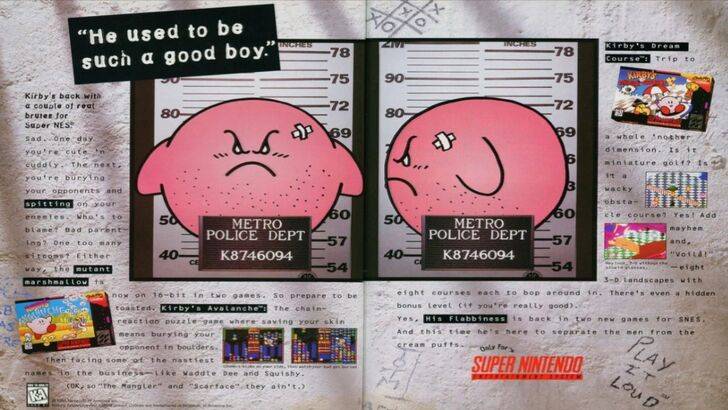
The divergence in Kirby's localization between Japan and the US began early. A notorious 1995 "Play It Loud" campaign ad featuring a mugshot-style Kirby proved to be an inflection point. Over the following years, Kirby's facial expression on box art varied significantly. Games like Kirby: Nightmare in Dream Land (2002), Kirby Air Ride (2003), and Kirby: Squeak Squad (2006) all featured Kirby with sharper eyebrows and a more intense expression.
However, facial expressions weren't the only adjustment. The original 1992 Game Boy release of Kirby's Dreamland, the first in the series, showcased a ghostly-white Kirby in its US version, unlike the pink original Japanese artwork. The Game Boy's monochrome display meant US players only saw Kirby's true pink hue with the release of Kirby's Adventure on the NES in 1993. Swan highlighted the resulting challenge: "A puffy pink character for boys who are trying to be cool just wasn’t going to get the sales that everybody wanted."
This ultimately led Nintendo of America to consistently alter Kirby's facial expression in US box art to broaden its appeal. More recently, global marketing for Kirby has become more unified, with a more consistent portrayal of Kirby, alternating between serious and gleeful expressions.
Nintendo's Global Approach
Both Swan and Yang concur that Nintendo has adopted a more globalized strategy in recent years. Closer collaboration between Nintendo of America and its Japanese counterpart has resulted in more consistent marketing and localization efforts. The company is moving away from regional variations like those seen in Kirby's box art, aiming to avoid past situations like the 1995 "Play It Loud" advertisement.
Yang acknowledges that while the global audience remains diverse, "It was a business strategy change to have more global marketing. It’s good and bad. Being global means consistency for the brand across all regions, but sometimes there is a disregard for regional differences." She suggests this might lead "to really bland, safe marketing for some of Nintendo’s products."
Game localizers attribute this trend, or lack thereof, to the broader globalization of the industry and the evolving demographics of gaming audiences. Western audiences now possess a greater familiarity with Japanese culture and sensibilities, many having grown up immersed in Japanese pop culture, including games, movies, manga, anime, and more.